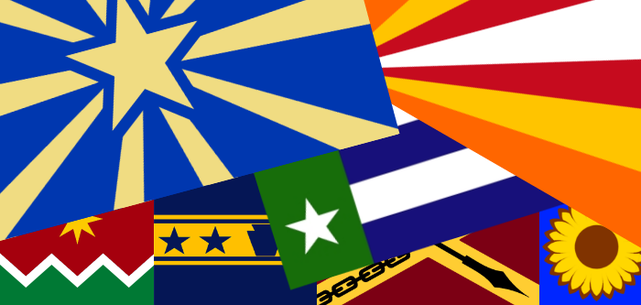
American State Flags
I'm hardly the first person to notice that America's state flags are pretty terrible. There are some bright spots, but as a group they make a very poor showing. Most take the form of seals placed on solid-colored sheets, a mess of text and scrolls and landscapes and heraldic supporters. Even when the flags are displayed as graphics it is hard to tell them apart, let alone when they are flying or hanging from a flagpole.
The house style for state flags has its origin in regimental colors during the Civil War. They were fine for that purpose - relatively ornate banners to be marched at the front of a column of troops. They do not do so well at the other things that a modern flag should do: providing focus for group identity and visually representing the state. Seeing the problem, many states changed their flags in the 20th century, but their main strategy was to slap on the state's name. Now you can tell the states apart if you can read the writing, but the designs are still bad.
Lots of talented, creative people have applied their energies to redesigning the state flags. Here I'm posting my picks. These are the designs I like best, including the current flags that are working well. I did not create most of these, though I have made tweaks here and there. I have tried to pick flags that not only look good, but would be widely appealing to people in the states. I've rejected most flags that are too weird or different or radical - a flag is supposed to build collective identity, not merely look good, so an interesting but bizarre flag can be counter-productive. This means that I favored flags that have a basis in history, or that have won contests, whether online or in real life, and established cred that way.
I get that states, whether inside or outside America, normally change their flags only when there is a major political change. South Africa, the Seychelles, Libya, and Myanmar/Burma have all adopted new flags in recent decades to mark the transition from a more authoritarian regime to a more representative one. Belarus's new flag commemorates movement in the opposite direction. But it's a rare thing for a state to change its flag just because the old one is bad. Any politician who suggests a change to the flag gets accused of wasting the state's precious time and money on something frivolous. We've seen this in the ridicule that Mr. Key has been subjected to when he decided to champion the cause of a new flag for New Zealand. In fact, there are quite a few politicians who would be doing a very rare bit of actual good if they championed a new symbol to inspire and unite the people of their states. But realistically most of these changes, while nice, are not likely to happen.
Alabama
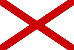
Alabama's flag is clear and clean. It's based either on an extremely simplified Confederate battle flag, or the Spanish Cross of Burgundy, or both. It's pretty much identical with the St. Patrick's Cross flag of Northern Ireland, as well as the international signal flag for the letter V. Nevertheless, it does a fine job representing the state. I say keep it.
Alaska

Alaska is another good one; I'd say it's one of the world's great flags. The symbolism is perfect for a land under the long northern night sky. And its origin story is nothing short of adorable: it was designed by a 13-year-old, part-indigenous resident of an Aleutian Islands orphanage in 1927. Even the boy's name, Benny Benson, sounds straight out of an old-timey comic book. Alaska really has no way to top this.
Arizona
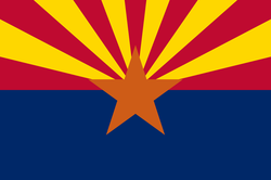
The A states really do have some decent flags. Arizona's is a great illustration of how unconventional designs can still yield excellent flags. That copper-colored star in the middle breaks a number of vexilological rules - it's a nonstandard color, it's too similar to the red, it's not separated from other colors by yellow or white. But the flag works, and beautifully! That radial symmetry of the sunburst is dynamic and exciting. And the overall look perfectly captures the wide, sunny valleys of the Arizona desert.
Arkansas

Just some small changes to this one. Arkansas's flag was designed in 1912 by Willie Hocker, a Daughter of the American Revolution. Her original had the diamond design of the current flag with three stars in the center, representing France, Spain, and the United States. Politicians later added the name of the state and a fourth star to represent the Confederacy. Both changes were completely unnecessary: the flag itself represents the state, so adding the name was redundant. Nobody's campaigning to add "USA" to the Stars and Stripes. And of course the flag's blue diagonals studded with white stars already evoked the Confederacy rather strongly.
Now Ms. Hocker's design may not be in the world's top ten, and anyway we want to steer clear of any Confederate fetishization; but it's distinctive and effective enough to keep as the base for a new flag. This design comes from HansLN, the administrator of the Vexillology Wiki. The stars number four to fit better in the diamond. That fourth star can stand for the Native people who ruled the state before colonization, rather than the Confederacy. The blue diagonals are replaced with plain white, so that a mixed-up Rebel Flag becomes a more wholesome diamond symbol to represent the state's gemstones.
Now Ms. Hocker's design may not be in the world's top ten, and anyway we want to steer clear of any Confederate fetishization; but it's distinctive and effective enough to keep as the base for a new flag. This design comes from HansLN, the administrator of the Vexillology Wiki. The stars number four to fit better in the diamond. That fourth star can stand for the Native people who ruled the state before colonization, rather than the Confederacy. The blue diagonals are replaced with plain white, so that a mixed-up Rebel Flag becomes a more wholesome diamond symbol to represent the state's gemstones.
California
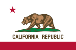
Another keeper. This one because of its proven use as a symbol and a focus for civic identity. It's not a strong design. The naturalistic bear and the text are just too complex for a thing that flaps and hangs from a pole. But it's iconic, and it's got a deep connection to California's history. So I'm keeping it.
Colorado
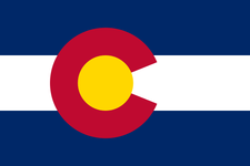
Colorado's flag gets credit for the richness of its symbolism. There's the gold nugget in the center; there's the fact that the red C stands for the red rocks on the bends of the Colorado River that are the source of the state's name. It's not a perfect flag - in my opinion it looks too much like a logo for a sports team - but it's a decent design and an effective symbol.
Connecticut
.png)
The three grapevines in Connecticut's state seal are well and good, but a much more powerful symbol is found in the Charter Oak. According to legend, Connecticuters hid their colony's charter in an enormous oak tree to keep it out of the hands of royal governor Edmund Andros, who sought to revoke the colony's liberties and impose tighter English control. The oak is perhaps the oldest symbol of American liberty and it belongs on the flag. This flag is Ken Morton's improvement of my own design. Its overall form comes from the New England flag, using blue for the field. In the canton, an oak replaces the usual New England pine tree.
Delaware

This design by Philip Tibbets combines symbols in very creative ways. The main device is a cross crosslet, which comes from the coat of arms of Lord De la Warr, who gave his name to the state. Arranged in this way, it also suggests the flag of Sweden; Sweden was the first country to colonize Delaware in the 1640s. The swallow-tail shape comes from the Swedish state flag. The buff and blue are Delaware's current state colors. They also suggest Sweden, but originally they come from uniforms during the Revolutionary War. Put together, these elements make up a beautiful flag. The chicken in the canton is Delaware's state bird. Honestly I could go either way on the chicken.
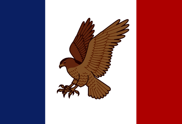
Florida
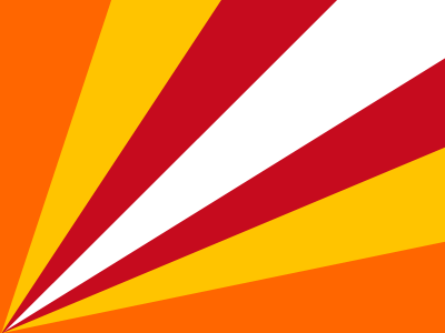
The basis for this design is a flag by "lizard-socks," a Tumblr-er who has done his own state flag redesign project. His original began with two red diagonals, which come from Florida's current flag and like Alabama's might represent either Spain or the Confederacy (though here, the Spanish connection seems more likely). Lizard-socks combined the red with orange and yellow rays for the "Sunshine State," and then centered the burst in the corner. The inspiration was the flag of the Seychelles, a beautiful design that is among the world's best. I rearranged lizard-socks's flag slightly to make the connection to the current red X a little more clear, and I added an extra stripe. It's busy, but I like it a lot.
Georgia
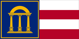
Few state flags have gone through as many changes as Georgia, so I don't suggest yet another change lightly. But the thing is, many of the recent changes were done to remove Confederate symbolism - but the current one, adopted in 2003, still uses the Stars and Bars as a template. So we want a change, but not a radical one. A design by DeviantArtist Achaley is a good place to start. Achaley turns the canton into a panel, and he also has an attractive symbol that simplifies the state seal without over-stylizing it. But the red-white-red triband is still a Confederate symbol, not a Georgian one. I suggest turning the three stripes to four, representing Georgia as the fourth state to ratify the Constitution.
Hawaii
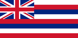
There aren't many flags with more history than the Hawaiian one. It has flown over Hawaii as a kingdom, an American puppet republic, a US territory, and now as a state. Some people are confused by the British Union Jack in the canton. Hawaii was never a British colony. King Kamehameha combined a British ensign with the stripes from a US ensign (which in those days, often included blue stripes) to represent his goodwill toward both nations, and his neutrality in the conflicts between them - this was just after 1812. The flag predates almost everything else in Hawaii and it would be crazy to suggest changing it.
Idaho

This flag is by "USA Celt," a user on the Vexillology Wiki. It represents the phrase "Gem of the Mountains," a common definition of the word Idaho. The etymology is wrong, but the phrase continues to be used as a state nickname. It's appropriate because Idaho does have actual gems in its actual mountains - specifically the star garnet, the state gem, which this symbol stylistically represents. I recolored USA Celt's blue sky to make it red. I think an earthier color works better for the state, and now it reflects Idaho's official state colors of red, green, and gold.
Illinois

This flag by Hans LN of the Vexilology Wiki was inspired by a 1918 flag by Wallace Rice, the designer of the Chicago flag. Hans reduced Rice's 21 stars to five, which I would re-interpret to mean the Illinois Confederacy, France, Britain, and the Illinois Territory, with the State being the big star in the center.The vertical stripe suggests the letter I. This would look great next to the Chicago flag without being too similar.
The design to the right by Philip Tibbets was my former pick, and I have very reluctantly moved it to runner-up. Its main symbol is a piasa, a flying creature from the folklore of the Illinois tribes. Tibbets' design is too awesome to ignore, but sadly I think it's just too weird to serve as a statewide symbol. |

|
Indiana

In 1778,a band of Virginia militiamen was detached from George Rogers Clark's regiment to take command of the fort at Vincennes on the Wabash River. Over the fort they raised this flag: 13 stripes of red and green. As the first American flag ever flown over Indiana, it's got a solid historical basis and there's something strong and tough about it. The National Guard, who tend to have a great eye for design, have flown it in Iraq. Indiana really ought to make this the official flag straightaway.
Iowa
Iowa's flag comes from the French Tricolore, based on Iowa's having been French territory at one time. The French had almost no actual presence inside the state, but I don't begrudge Iowa's flag for commemorating France any more than I begrudge an American bragging about his 1/16 Irish ancestry every March. Celebrating tenuous connections to European countries is our thing. So Iowa's flag stays the same, though they should get rid of their mass of text and replace the generic American Eagle with something that better represents the Hawkeye State.
Kansas

Kansas is unique in that it has an official "state banner" alongside its state flag. The banner is meant to be hung from a horizontal bar rather than flown from a pole. Its design is a simple sunflower on blue. That's such a good design and effective symbol that many people have suggested that Kansas should just use it for its flag. This specific graphic comes from a blogger who goes by "Alternateuniversedesigns."
Kentucky
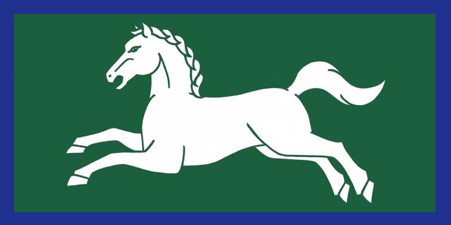
Kentucky is the third and final flag whose design I take from the talented Mr. Philip Tibbets. Many Kentucky flag proposals, from Kentuckians as well as out-of-staters, use horses as primary symbols. This flag places a white horse on a background of dark green suggesting Kentucky bluegrass. I added a blue border to the original to make it look less like a copy of Tolkien's banner of Rohan; the blue comes from the state's current flag.
Louisiana

This design is by Andrew Boada. In the canton he places "a fleur-de-lis, a reference to the French influence on the state, and I've recolored the stripes to match the colors of the Spanish flag so to allude to the Spanish role in its former colony." As symbolism goes, you can't get much richer than that, and the result is a very sharp design that seems to exude the essence of Louisiana.
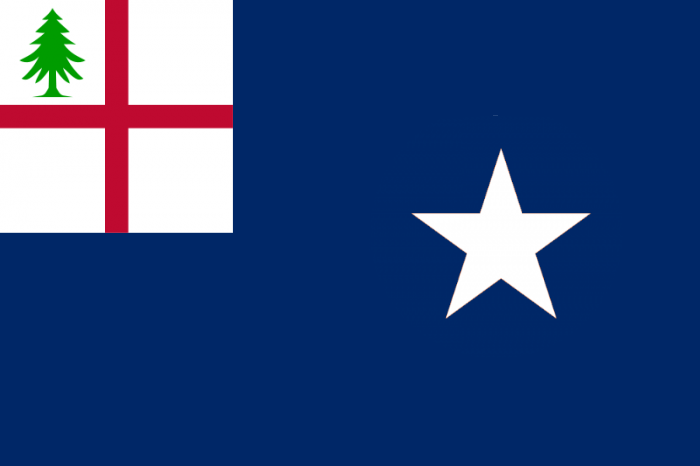
Maine
The crest of Maine's coat of arms - that is, the part above the shield - is a star within rays together with the motto "Dirigo" ("I direct"). This is a questionable heraldic crest but makes a nice design for a flag. The flag uses the Revolutionary colors of buff and blue that were found on Maine's first flag of 1901. NJI Media's United We Brand project helped to inspire it, but the design is my own.
Maryland
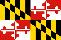
Maryland's flag is resplendent in its heraldic glory, refuting forever the idea that busy designs can never be good designs. They come from the arms of Lord Baltimore, the colonial proprietor of Maryland.
Massachusetts
This design comes from Sammy McKittrick. It is simple and elegant. It's the so-called Bunker Hill flag (probably never actually flown at Bunker Hill), which itself is based on colonial New England flags, with the addition of a white star. The white star represents the state itself and is taken from Massachusetts' coat of arms.
Michigan

This flag for Michigan appeared in 2006 on a website by Christopher Zervic, and it has acquired a small following. The symbolism is straightforward: two peninsulas and five Great Lakes. The flag nicely captures the spirit of Michigan. It would look great flying atop a picturesque lighthouse on a windswept bluff.
Minnesota

This "North Star Flag" appeared in 1989 as an alternative flag for Minnesota. It was designed by William Becker and Lee Herold. The flag picked up numerous supporters in politics and the press, but in the end it didn't go anywhere. As a good flag with an actual support movement behind it, the North Star Flag would do an excellent job representing Minnesota.
Mississippi

In 2020 Mississippi legislators and voters finally rejected their old state flag, which still flew the Confederate Battle Flag as a sign of defiance against racial integration. The final choice was credited to four people: Rocky Vaughan, Sue Anna Joe, Kara Giles, and Micah Whitson. It's a very pretty design with only one flaw, the words "In God We Trust" awkwardly placed in the ring together with the stars. But this was not the designers' fault: it came from the rules laid down by the legislature. A Redditor called "ItsZachHere" made a version that removed the words, among other changes. I think that other changes are not necessary, so this version just deletes the words.
Missouri

The shield on Missouri's state seal has a waxing crescent moon and a grizzly bear, representing hope and strength. The third element is a complete reproduction of the Seal of the United States, representing the fact that the designer didn't know what he was doing and just got lucky with the moon and bear. This flag takes the good parts of the seal and separates them with a wavy line. The line represents Missouri's rivers and evokes the iconic flag of St. Louis. The idea for this flag came from "BigRed618," a user on the Sports Logos forum.
Montana

I love this design by Andrew Rogers. Two mountains that form a stylized M. Their colors suggest "Oro y Plata" ("Gold and Silver"), the state's official motto.
Nebraska

This graceful flag comes from the blogger and graphic designer Steve Lovelace, best known for his "Corporate States of America" brand map. Sometimes, when designers from the world of corporate branding try their hand at vexillology they end up with things that look too much like logos and not enough like flags. Mr. Lovelace, however, has a great understanding of flags as flags and has come up with some real gems. This one represents the Nebraska landscape of corn and sky. The main symbol is the state flower, the goldenrod.
Nevada

This redesigned flag for Nevada by John Karp attracted considerable local attention and won two public contests in 2001. The most prominent symbol, the snow-capped peak, references Nevada's name in Spanish ("snowy," referring to the Sierra Nevada). The shape of the cap resembles an arrowhead, while the star comes from the current state flag. Blue and silver are Nevada's official state colors.
New Hampshire

"The Granite Banner" was created in early 2016 by a Redditor going by "Paris1871". The stars at the hoist and the plain blue field are inspired by different flags from the era of the Revolution, while the black stars on white represent not just "the Granite State," but also the bark of the paper birch, New Hampshire's state tree.
New Jersey

The website NJ.com had a contest to redesign New Jersey's flag in 2015-2016. Judges narrowed more than 400 entries down to ten, and in the online poll this flag by Andrew Maris, from the Jersey Shore community of Fair Haven, was the clear winner. I personally feel that a New Jersey flag ought to have the official state colors, buff and blue, but I give preference to contest winners, and there's no denying that it's a strong flag. Like the state colors, the design comes from Revolutionary War uniforms, in this case the "Jersey Blues" of the First Regiment, whose uniform was a red vest, blue coat, and white sash.
New Mexico
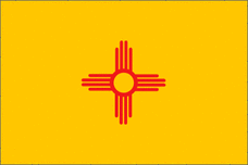
The North American Vexillological Association has named New Mexico the best of the state flags. I prefer Maryland, but there's no denying that it is a very good and adaptable design. The device is a solar symbol from Zia Pueblo, a great way to honor New Mexico's indigenous heritage.
New York

Jack Expo's design for New York has made its way around the Internet since he posted it in his blog, FixTheFlags, in 2011. The colors come from the old flag of the Netherlands, colors also used in the flag of New York City. Arranged in this way, they suggest the east-west orientation of the state with the Erie Canal running along its spine. Bold, simple, and effective.
North Dakota

In 1957 the North Dakota National Guard, realizing that the state's seal was a hideous landscape exactly like the hideous landscape seals of neighboring states, created a new coat of arms. The symbols on the shield (actually an arrowhead) represent some of the state's early settlers, while the crest of arrows represents the Sioux warriors. For the flag I suggest a straightforward banner of arms, rendering the design from the arrowhead onto a rectangle. The Native American symbolism is lost, but it's still a good flag.
North Carolina
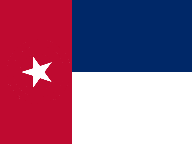
When North Carolina seceded from the Union in 1861, it adopted a flag similar to this one, with the addition of dates representing its declarations of independence from Britain in 1775 and 6. Later, for inexplicable reasons, North Carolina shuffled the colors to make their flag a perfect copy of the Texan flag, but added a bunch of text and scrolls to compensate. This design goes back to the original pattern, without the text. I followed a user called "Pimsleurable" in tilting the star to help set it apart. I also made the star smaller, again to distinguish it from Texas.
Ohio
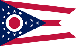
I love Ohio's flag, never mind the naysayers who say the shape is wrong or the design not distinctive enough. I think it's a great example of how to allude to the American flag without specifically copying it. The largest symbol represents both a buckeye and the letter O. The flag is unique, evocative, and fun, and I see no reason to change it.
Oklahoma
The shield symbol on Oklahoma's flag is probably a little much. But like California's imperfect but iconic bear-with-text, it has represented Oklahoma very well for a long time. It could use some adjustments, however. The name of the state has to go: the symbol itself is so distinctive, there is no need for an additional label. Then for this flag I combined elements from two artists. The new rendering of the shield is by former Redditor Buddhafy. I find it less cluttered than the original. The earth-toned tricolor comes from a design by Stephen Richard Barlow.
Oregon

Oregon had a contest in 2009 to redesign their flag. The entries were impressive, but the result was frustrating. The push to redesign the state's sub-par flag faced backlash from below - many people felt nostalgic about the flag, however lousy the design - and indifference from above. Even after the contest was over, not one politician could be found to actually sponsor a bill to change the flag. This was the winning design in the competition by Randall Gray. It shows the value in continuity: the beaver comes directly from Oregon's current flag.
Pennsylvania

Pennsylvania has the benefit of the keystone, a strong and instantly recognizable graphic that represents the state. Of course it doesn't appear anywhere on the current flag, which is a terrible mishmash of various flora and fauna on a plain field of dark blue. The challenge in finding a good design for Pennsylvania is not the lack of good ones, but the overabundance. This one by Mark Luther I find particularly striking. Luther originally had the keystone flanked by four stars for no particular reason; I made them only two because Pennsylvania was the second state.
Rhode Island
.svg)
Like many others, I suggest that Rhode Island return to the flag it used in the late 19th century. Its current flag uses a gold anchor and gold stars on white, which just looks solid white at a distance or when moving in the wind. Gold on blue is much easier to see. You might say that this looks too much like the European Flag; I would answer that Rhode Island used it first.
South Carolina
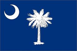
The flag of South Carolina is lovely and has a very long history. It should stay.
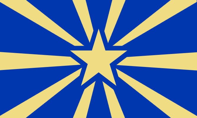
South Dakota

South Dakota once had a fine flag: a sun on a pale blue field. But over the years it has unnecessarily accumulated an ugly, complicated seal. .
In 2012 the state legislature came close to passing a bill to establish as the new state flag a design by renowned local artist Dick Termes. It incorporates the sunburst along with a medicine wheel representing the state's Native cultures. The flag breaks a vexilological rule - you're not supposed to have two different shades of one color, let alone three - but it's beautiful nonetheless. I'm suggesting a version of the Termes flag without the black outlines that were in the original artwork. It's not totally clear whether the outlines are part of the actual flag design, or just the prototype that was printed in 2012; and I think the flag works better without them.
In 2012 the state legislature came close to passing a bill to establish as the new state flag a design by renowned local artist Dick Termes. It incorporates the sunburst along with a medicine wheel representing the state's Native cultures. The flag breaks a vexilological rule - you're not supposed to have two different shades of one color, let alone three - but it's beautiful nonetheless. I'm suggesting a version of the Termes flag without the black outlines that were in the original artwork. It's not totally clear whether the outlines are part of the actual flag design, or just the prototype that was printed in 2012; and I think the flag works better without them.
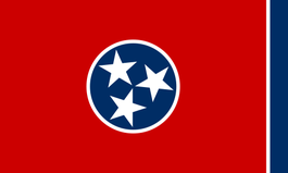
Tennessee
I don't get why the stars are tilted at that angle or what the blue bar is doing at the fly, but the flag of Tennessee is popular and effective. It nicely represents the state.
Texas
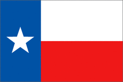
Let's not mess with it.
Utah
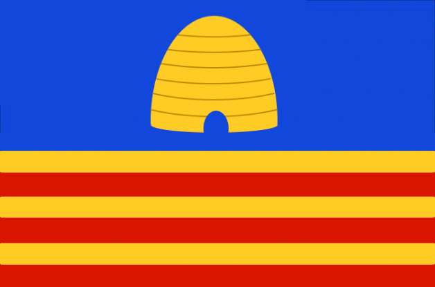
This proposal comes from the Organization for a New Utah Flag, a group that began in 2018 and churned out a large number of related designs before settling on this one. The flag gathered a good deal of momentum in 2020 and 2021. It has been declared the official flag of Utah's 125th anniversary, but it would be very effective as the permanent flag of the state.
Utah's most prominent state symbol, the beehive, is a necessary part of any state flag. The white star represents statehood. The partition per saltire represents a crossroads and alludes to the completion of the Transcontinental Railroad. Red stands for the desert, white the Rockies, blue the Great Salt Lake. The five sections represent Utah's five Native tribes: the Ute, Paiute, Navajo, Shoshone, and Goshute peoples. As a very good flag with an active movement supporting it, this is an easy choice.
Utah's most prominent state symbol, the beehive, is a necessary part of any state flag. The white star represents statehood. The partition per saltire represents a crossroads and alludes to the completion of the Transcontinental Railroad. Red stands for the desert, white the Rockies, blue the Great Salt Lake. The five sections represent Utah's five Native tribes: the Ute, Paiute, Navajo, Shoshone, and Goshute peoples. As a very good flag with an active movement supporting it, this is an easy choice.
Vermont

This was the flag of the Green Mountain Boys in the Revolution. For that reason, it has become associated with Vermont's short period as an independent republic, though it was never used officially in that way. It is the flag that the Vermont National Guard used when they were deployed overseas. Why it's not the official state flag is a mystery.
Virginia

Virginia's flag and seal feature the figure of Virtus treading on the dead figure of Tyranny, who clutches a chain and scourge and whose crown lies on the ground nearby. It's by far the most in-your-face revolutionary of any American flag; even that defensive rattlesnake seems tame by comparison. Any new Virginia flag should keep this spirit. This design fits the bill, using the spear and broken crown from the seal as its main image. It's a group effort, originating in a mostly-blue flag by the Redditor "Chiguyante" with later adjustments by vexillologists William Strannik and Randy Young.
Washington

The current flag of Washington is a portrait of the Father of His Country on a field of green. A portrait on a flag? It used to be done a lot, mostly with images of saints, but it looks really odd today. It's silly, anyhow. We have a perfectly serviceable system for representing a person on a flag: heraldry. George Washington's iconic coat of arms is already used as the flag of the District of Columbia, but the blogger Alternateuniversedesigns has made this wonderfully creative interpretation for the State of Washington. The three stars remain, while the two stripes have become Mount Ranier and the Pacific shoreline. The colors reflect the lush natural landscape.
West Virginia
This one is mine. I use West Virginia's state colors, "old gold" and blue, to make a pattern suggesting both mountains and the initials of the state. The white border is a reference to the current flag, which is white with a blue border.
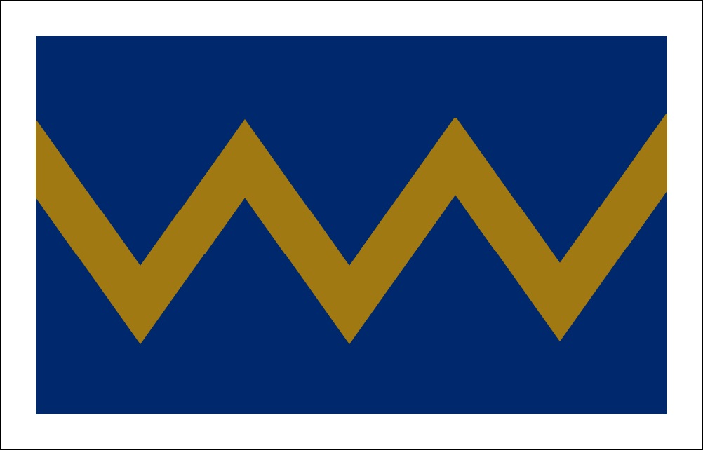
Wisconsin

Reddit had a contest to redesign Wisconsin's flag in 2014. Dozens of designs were submitted, many of them better than anything I've seen elsewhere, and all of them better than Wisconsin's awful current flag. Most entries incorporated arrows and movement to represent Wisconsin's inspiring motto, "FORWARD." The winning design, by Redditor JDDallas, absolutely deserved it. Shape, angles, and colors work together to create a clear message of hope and progress. The red angle in the center refers to the original meaning of Wisconsin, "Red Stone Place," meaning the sandstone bluffs that overlook the Wisconsin River at the Dells.
Wyoming
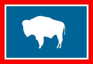
Many people have noted that if Wyoming just removed the ugly seal, it would have a decent state flag. That's a good idea.
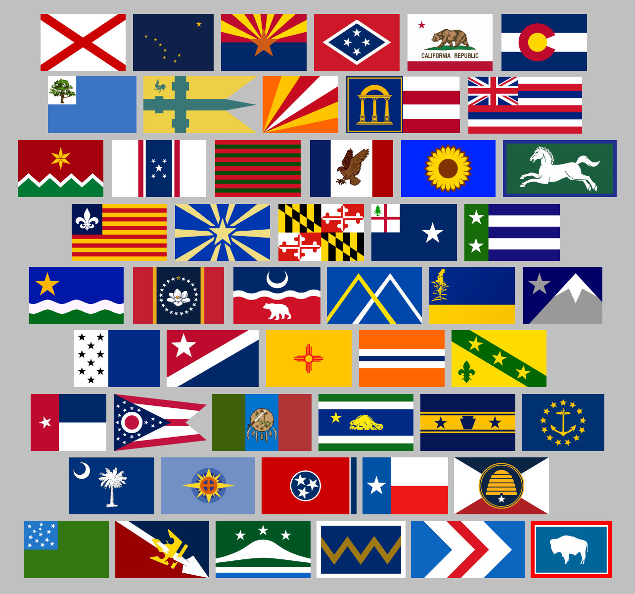
The Complete Set
United States Territories
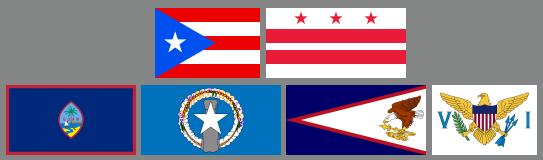
Beyond the fifty, not many people have tried to redesign the flags of the territories of the United States. Puerto Rico and the District of Columbia, the two territories that should already be states, already have beautiful and popular flags.
The other territories are probably too small to ever become states, but they could still use a little love from the vexillological community. Guam's flag looks pretty good for a seal on a sheet, but at the end of the day it is still a seal on a sheet. The Northern Marianas have a good start with the stone and chain of flowers, but they're obscured by the big white star over everything. The flags of American Samoa and the US Virgin Islands are just inexcusable. I'm hopeful that the collective creativity of the Internet can produce some better alternatives in the future.
The other territories are probably too small to ever become states, but they could still use a little love from the vexillological community. Guam's flag looks pretty good for a seal on a sheet, but at the end of the day it is still a seal on a sheet. The Northern Marianas have a good start with the stone and chain of flowers, but they're obscured by the big white star over everything. The flags of American Samoa and the US Virgin Islands are just inexcusable. I'm hopeful that the collective creativity of the Internet can produce some better alternatives in the future.
The Star-Spangled Banner
I've got controversial opinions about the flag of our republic. It's a beautiful and well-established symbol - but it's also an almost incomparably busy design. Does any other nation's flag have 50 of anything? The 50 stars are a powerful symbol of the country's history and its federalism, but from an aesthetic perspective they're very hard to justify. Flags can't always represent absolutely everything, and when designing one it's sometimes necessary to sacrifice symbolism in favor of simplicity.
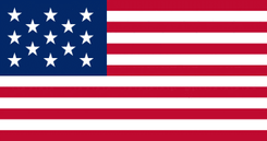
Controversial, as this may sound, I'm not alone in thinking it. The USA's national teams have sldo recognized that the design is too busy and adopted a 13-star flag for their logos. It's an instance where the rules of vexillology and logotypography overlap: whether flag or logo, a design should be no more elaborate than necessary. Thirteen stars arranged like this are enough to maintain the overall look of the flag without all the clutter, and of course they represent the original states that came together to form a new nation; out of many, one. This is therefore my suggestion for the American national flag.

